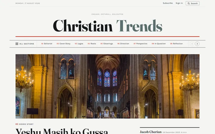
Newsprint
The restrained one. A newspaper front page: a centred serif masthead, hairline rules and a numbered contents index that follows every section through the page.
Christian Trends
Each one is a complete working home page built on the same real articles, so what differs between them is the design and nothing else. Open any of them and scroll, use the menus, and try them on a phone.
The restrained one. A newspaper front page: a centred serif masthead, hairline rules and a numbered contents index that follows every section through the page.
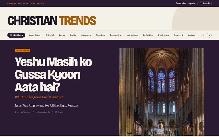
Composed and warm. Deep aubergine slabs cross the section boundaries, and the article cards sit half on the slab and half off it, so the page reads as layers rather than rows.
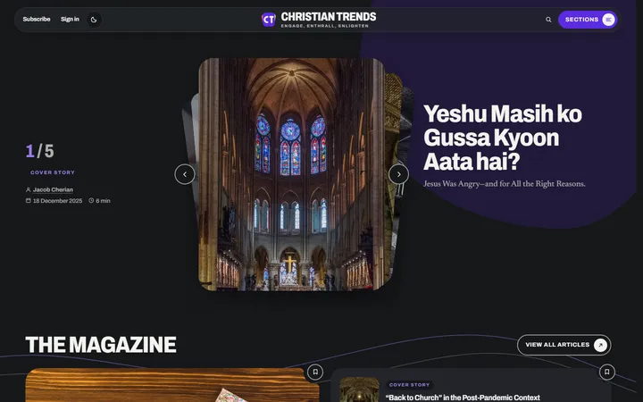
The only one that switches between light and dark. The lead stories are a deck of cards you deal through, and the page is built from big blocks with a large radius.
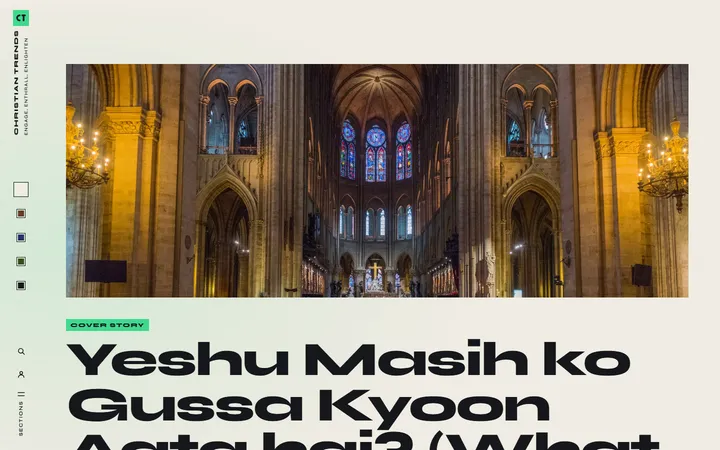
Scrolling it feels like moving through rooms: every section is a full-width field of its own colour, and the layout gets denser as you go, from one article filling the screen to the whole magazine on one.
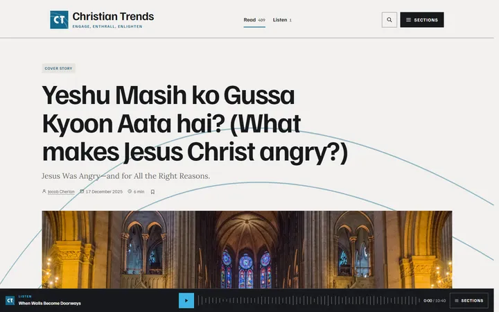
Built for a magazine that will also be listened to. There is no fixed header at all: the masthead scrolls away and a player rail stays along the foot of the screen, with long arcs tying the sections together behind the type.
All five use the same articles, authors and images from the Christian Trends archive, so they can be compared on design alone.
The audio in the Signal direction is a stand-in file, there to show how the player behaves.